10 Steps toward Great Visual Merchandising

Let’s say you’re in the market for a diamond necklace. You looked online and found two stores with the necklace you want; both at the same price. Both stores are on the same street and you’re walking up to the first one now. Let's look in the window...
Hmm... this store is not well maintained. Their dusty window if full of dimly lit junk: cigarette lighters, sun glasses, shoe shine brushes, cell phones. Necklaces hang from wire racks next to a selection of sun-bleached men’s ties. There's a fair number of cobwebs and a dozen dead flies lining the bottom of the window. Somewhere in there is the necklace you want. Hmm... Let’s walk on.
The second store is also an older building but the window is clean. The glass reveals a panel covered in clean black velvet. Alone in the center of the window is a soft red-velvet pillow on a short stand that is draped in black satin. Three spotlights converge onto the pillow illuminating the diamond necklace in a pool of brilliant golden light.
There is nothing else in the window except a small card stating, “Talk is cheap.”
Where would you rather make your purchase?
That’s the value and the power of presentation in selling.
This example demonstrates how a little work, clean glass, a few yards of velvet and a few lights can affect sales. But techniques vary based upon what you are selling.
Let’s take another example.
We're having a party
You’re at a party. A waiter threads the crowd with a tray of hors d’oeuvres. Unfortunately, by the time he reaches your group there’s only one left. Five people gaze hungrily at the tray.
Ever notice that when there’s just one of something, it’s harder to accept? This is the law of abundance in reverse. You can see this same technique used to move merchandise in warehouse stores where there is so much of one item it’s easy to take just one. So you have to select the right approach.
With an expensive item, you usually want to make it seem "exclusive" and "special" even if you have 100 more in the stock room.
With a cheaper item, you want to make it seem "abundant." Put a whole pile of them there.
Still, there are exceptions. An upscale grocery might create quite a stir with an isle of displays that treated individual vegetables as if they were high-end jewelry. People would notice. Move the velvet display into a grocery and swap out the necklace for a potato. Now it’s over the top (funny). In any kind of marketing, a playful approach is hard to beat. This grocery concept would work because people notice the unexpected.
So without delving into actual composition, let’s look at 10 basics necessary for a successful display that anyone can do:
1. Put your most sensible foot forward
Selecting what to display is a strategic decision. What do you have in stock? What’s most popular? What will customers notice? What is profitable? What generates additional sales? (For example, cake mix generates additional sales of milk, eggs and butter). Somehow the item you select to put on display must make sense for your business. The general formula is attract, interest and sell. Window displays attract and interest people so they will come into your store. Now they can talk to a sales person, try something on, or take a test drive.
2. Focus attention
Have you ever tried to persuade someone who wasn’t really listening? It doesn’t work.
People only have so much attention to give. Show a customer one product and you’re dealing with 100% of their available attention. Show them two products and you’ve got only 50% attention on each one. That’s called splitting attention. And the more products you add, the worse the math. Some store owners violate this principle hoping that something in the window will catch the eye. In practice, however, the normal result is to catch nothing at all. The average passerby sees nothing at all.
On the other hand, there’s nothing wrong with grouping related products together and selling them as a package. Restaurants sell complete meals, clothing stores sell outfits, tools are sold in sets. In the 1970s the concept was to “tell a story.” An example would be men’s flannel shirts positioned with bags of charcoal briquettes and a hammock. While juxtaposed might be a display of yellow summer sun dresses or bikinis intermixed with red fire extinguishers. Several interpretations could be made of these two displays.
3. Mask distractive background
What else can the customer see through your window? If they can see into the store, you must ask yourself if this is going to enhance the overall effect or detract. Depending on the setting, it could go either way.
If viewing above and around the display is distractive, if it looks cluttered, use a backdrop of some sort to wall off distractions. Cover the background panel in fabric or display vinyl. This could be a large panel, or even "seamless" photography paper which comes in dozens of colors in rolls that are 9 feet wide by 35 feet long. There were many years when I used to go through 15 or 16 rolls in a week at an apparel trade show. We used "seamless" to cover the walls and shelves and change the color of a room in about 10 minutes.
4. Keep it clean
A dirty or dusty window display lowers not only perceived value of the product, but also the integrity and control of store management. Five minutes with a feather duster can make a huge difference. Window glass is best cleaned before the display is done, using a solution of clear ammonia and water. Wipe edges with clean paper towels or newspapers to blot up excess water.
5. Present the correct quantity
Now that you’ve selected an item and limited distractions, you need to decide how many products to put on display. This decision may pivot on price. Generally speaking the less involved the customer is in the purchase of the item, the more you may want to display a volume of the items on display. For example, a potato does not require a lot of thought on the part of a buyer, whereas an expensive watch does. So display only one of the watch, but offer potatoes in a huge pile.
6. Elevate
Get your items off the ground. To put something on a pedestal or platform is to glorify it. Remember the old idiom about putting someone on a pedestal. You can cover a box in velvet or display felt, buy a plastic column from a display supply, or use a table. Never place items on the floor in a display. Make it special. Elevate.
And if you have multiple items in the same window, put some items on different levels to break up the visual monotony and make it more interesting.
7. Cover surfaces
What makes a better impression when receiving a present? Wrapped or unwrapped? Exactly. Cover stands, boxes, panels and platforms. Drape tables. Use satin, velvet, rich brocade or display felt (which comes in widths of 72” and is available in most fabric stores), or use glossy display vinyl (printed to look like glossy marble, metal flake or other showy colors). Vinyl normally comes in rolls about 51” wide.
People often judge value by observing the way you treat the item. Imagine a museum curator is going to reveal to you the sacred finger bone of St. Peter. He comes out, glances about absent mindedly... "Let's see, where did I?" Pats down his pockets and... "Oh, yes, here it is with my car keys." That just wouldn't happen. If it did, you'd be sure the bone was a worthless fake. No, no, you'd expect an armed guard to follow behind the curator, sentries taking positions at each door, thence comes Inspectors who check your identification and check the table for dust and to make sure it is wobble-free. They require you to don gloves and a white lab suit, thence come the Royal Trumpeters and thence, finally, come the Bearers of the Sacred Bone, two ahead and two behind holding a giulded box, thence comes the rear guard... You haven't even seen the bone yet, but with the people and "thences" coming your way, you'd be pretty sure it was very valuable.
Now, I know, quite possibly you cannot yet afford Royal Trumpeters at your store. But you can at least do something to fix up the space where the item will be put on display to show people you consider it valuable.
8. Accent with light and shadow
To “stand in the spotlight” is synonymous with being the center of attention. When you light something brilliantly and cast its surroundings in shadow, you force attention onto the lit item in a dramatic and powerful way. The best practice is to use both light and shadow to make a display item “pop.” Painters of the Italian Renaissance called it “chiaroscuro” from Italian, from chiaro ‘clear, bright’ (from Latin clarus) + oscuro ‘dark, obscure’ (from Latin obscurus).
9. Use signage
The use of signage in a window display gives the chance to reinforce the purpose if tasteful and clever. You want your display to be as powerful as possible but since the ultimate goal is to sell there are times when the whole composition will benefit from a word or two. Or perhaps a brand name or logo positioned somewhere. In fact, there are times when the omission of the brand name would be sheer idiocy. Take, for instance, a series of window displays interpreting a new fragrance. Such a display would make no marketing sense without the name of the brand somewhere visible.
But in most cases, unless you have a really good idea for a sign, leave it out. As a comparative, advertisements sometimes include a tag line or slogan. Among advertising professionals, the rule is unless the tag line is spectacular leave it o-u-t! Like a bad haircut or botched plastic surgery, a mediocre tag line will do more harm than good. Many advertisers don’t understand this. “What’s our slogan for this campaign?” They think they have to have a slogan. Not true.
Perhaps one of my best tag lines was created for the Richard Nixon Museum and Birthplace, a rather challenging campaign considering I was not a fan of Richard Nixon. My grandmother was a political activist and an arch enemy of Tricky Dick since the 1950s. His name never came up without her saying, “Steve, that Nixon is as crooked as a dog’s hind leg!” In my research, I found that despite his flaws (we all have those) there was (I hated to admit) another side to the man. He accomplished some remarkable things. My challenge was how to promote the museum without whitewashing any wrong doing or violating my integrity. So I wrote a series of headlines around the watergate scandal. My tag line was, “You don’t know Dick.” Very true. Very true. And whether you love Nixon or hate him, the headline works either way.
The moral of the story, use signage (but only if it improves the message).
10. Add trim
Foliage, flowers, ribbon, a velvet pillow, tree branches, rusty steel, a wicker basket... in the display profession, props such as these are called “trim.” Older dictionaries give a definition of trim as a, “decorative addition.”
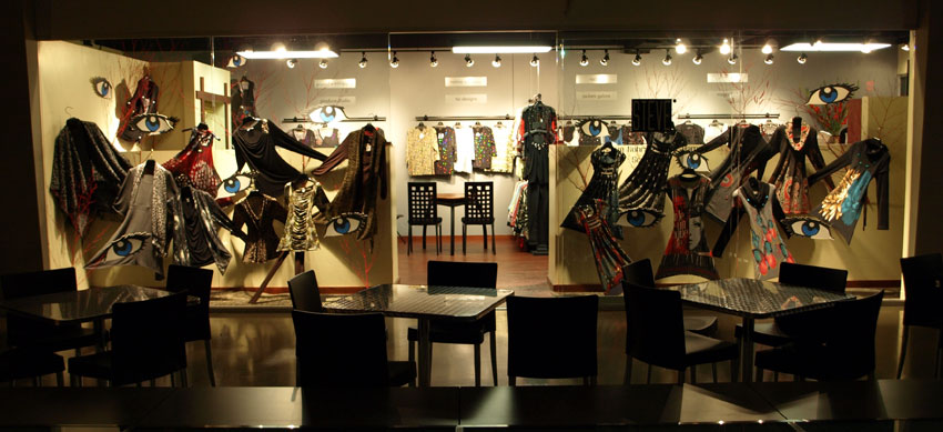
In fact, it might interest you to know that for decades, a display artist in the apparel industry was called a “trimmer.” It was the established proper name of the actual profession given right in the dictionary. In the main, trimmers worked mainly with wires instead of mannequins, making clothes appear to "float" or "fly" magically in mid air. We habitually added in decorative additions such as dried foliage, flowers, or ribbon—all manner of things to catch attention or tell a story.
As a verb trim is used in the same sense as to “trim” a Christmas tree, meaning to add lights, tinsel and ornaments. Any display can be improved with the addition of trim just as a Christmas tree is improved with lights and bulbs and singing weasels. Okay, leave out the singing weasels.
In the '60s, '70s and '80s trimmers and the apparel industry went hand in hand. Every showroom had a trimmer who decorated the showroom and built displays. And real trimmers worked incredibly fast. They had to. Most of the traveling salesmen (or women) came in (from the road where they had been selling) just two or three days before the show started. And with the salesmen came their samples (the clothes we needed to put on display). So until everyone arrived there was nothing to do. Then, they would all show up at once in an avalanche. So during those 3 or 4 days, trimmers — all of them — worked around the clock. I can't speak for everyone, but if I got 2 hours sleep in 60, I considered myself lucky. Then again, taking myself as an example, I earned in those 3 or 4 days what my friends were earning in 3 or 4 months. In 3 hours I could earn the equivalent of two weeks at a normal job. Say what you will about adrenalin or caffeen, the most powerful stimulant in the world is cash.
But back to our thread and to the point:
If an entire industry thrived around the effort and effectiveness of trim, you can bet it is still an effective device today.
Use displays to improve your sales
Those are the basics of display and I ought to know. With almost 40 years experience as a display artist and literally thousands of displays under my belt, I probably qualify more than anyone as an authority on the subject. I’ve trained people how to do it, delivered seminars and workshops, written articles and even a manual on the subject.
I started doing apparel displays while working at The Gap when I was 17. Their business improved so much that after only a few months, I was their Southwest Regional Display Manager. With a successful operation in the retail sector, I moved into the wholesale end of the apparel business and within a year I was probably among the highest paid (and hardest working) trimmers in the world.
Since then I’ve mastered other creative fields but throughout it all I’ve remained active as a display artist. And in all those years, I never lost a customer to any rival.
What kind of return on investment can a display generate? Obviously it depends on the scope of the project. I remember a new salesman for a shirt company named Hank Robinson. He put down $100 for a display in 1980. The next morning a buyer walk by, saw the display, did a double take, walked in for a closer look and wrote out a $30,000 order. Not unusual at all. Hank's commission would have been 10 or 12%.
In the '90s, a non-profit organization needed to fund a new project. They engaged me to design and build a large exhibit to show what they were all about. From that exhibit, they generated millions of dollars in donations — a 5,000% return on investment.
History has shown that presentation has a direct impact on sales.
I hope this has been an enjoyable read and moreover I hope it helps you. Good luck.


